You’ve been applying to jobs, updating your portfolio, and tailoring every resume to each job you apply to, again and again.
And yet the answer is always the same. Rejected or ghosted.
You keep wondering, What am I doing wrong?
I’ve mentored designers who felt exactly like you. Stuck, unlucky, doubting themselves. And then, almost overnight, they flipped the script. Some got hired on the spot. One walked out of an interview with a salary offer she never thought possible.
What changed was that they learned to talk about their work the way companies care about.
See, you probably do what most juniors do:
You spot a clumsy app. You jump straight into wireframes and redesign the whole flow. But here’s what employers hear: “I don’t actually understand how businesses work.”
The problem isn’t that you can’t design. The problem is that you haven’t shown you can name the right problem, in the right way, with the right impact.
Once you fix that, rejections start turning into offers. You stop sounding like a beginner and start sounding like a senior designer, someone they can trust.
Mastering how to write ux problem statements as a junior designer is the best way to start fixing and articulating your thoughts so you talk about your work ocnfidently.
Why rejections happen (and how to beat them)
Let me tell you something that might sting but needs to be said: you can make pretty screens. That’s not the problem.
The problem is that very few juniors know how to frame a clear problem – one tied to a specific user moment and a real business effect.
When you walk into that interview room, the hiring manager is listening for just four things:
- Who is struggling?
Not “users” or “people.” They want you to name someone real in a real moment.
Think: “First-time buyers trying to complete checkout on their lunch break.” - What exactly breaks?
They’re testing if you can pinpoint the friction.
Not: “The app is confusing.”
But: “The payment form throws generic errors that don’t tell users how to fix their mistakes.” - Why should we care?
This is where most juniors lose the job. You need to connect the friction to consequences that matter, for users and the business. Real numbers. Real impact. - What limits our solutions?
Senior designers never ignore constraints. Tech debt. Compliance. Budgets. Mention them, and you stop sounding naive. You sound like someone who’s worked in the real world.
If you can speak clearly about these four things, you’ll stop sounding like a beginner. You’ll sound like a senior designer even as a junior. Hiring managers won’t see you as another junior hoping for a chance. They’ll see you as someone ready to solve real problems.
And that’s the difference between another rejection and an offer.
What is a UX problem statement and how is it different from a hypothesis?
You know what breaks my heart? I see so many talented designers like you writing what they think are problem statements… but they’re not. They’re writing something else entirely.
A real UX problem statement is simple but powerful:
It’s a short, evidence-based sentence that names a specific user, in a specific moment, facing a specific friction, and why it matters to both the user and the business.
That’s it. Clear. Focused. Testable.
But here’s what you’re probably writing instead:
- Feature requests that sound like: “We need a new search button on the homepage.” That’s not a problem statement. That’s a solution in disguise.
- Vague wishes like: “Make the app easier to use for everyone.” But when you say “everyone,” you’re really saying “no one specific.” And employers hear that and think you don’t know how to prioritize.
Solutions pretending to be problems, like: “Users struggle with navigation, so we should add an AI chatbot.” Can you see what happened there? You skipped the hard part. You leapt straight into a fix without proving you understood the root cause.
When you do that, employers don’t see a problem-solver. They see someone guessing. Someone who can’t be trusted with real business challenges.
But when you write a crisp, evidence-based problem statement, you flip the script. You sound like someone who thinks first, designs second. And that’s the kind of designer who gets hired.
How to Write Problem Statements That Actually Get You Hired
So, let me teach you something that changed everything for the designers I mentor. I call it the One–2–One Pattern, and it’s going to become your new best friend.
Here’s how it works:
One clear problem → 2–3 screens that actually fix that problem → One line about user and business impact
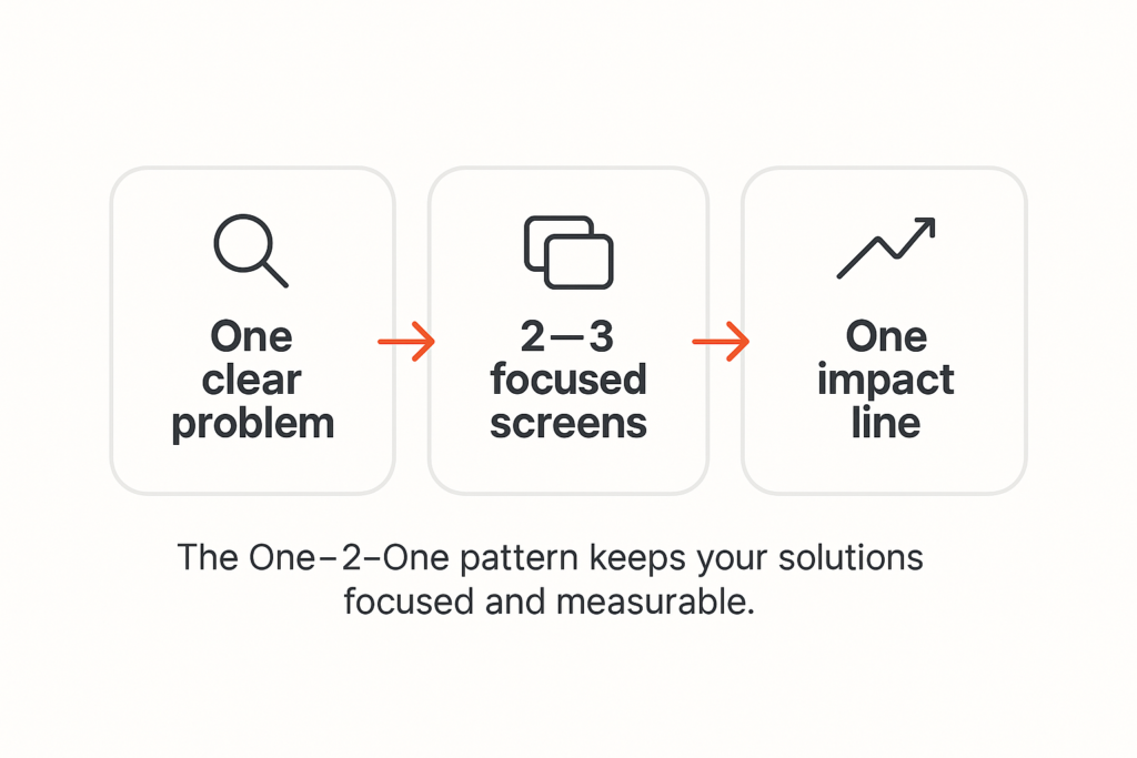
This isn’t just about writing better. It’s about thinking better.
- When you focus on one clear problem, you stop designing random features that don’t connect to anything real. You become sharp and trusted.
- When you limit yourself to 2–3 screens, you force yourself to find the smallest possible change that makes the biggest possible difference. That’s exactly what senior designers do when resources are tight and deadlines are brutal.
- And when you write that one impact line, you prove you understand the heart of design: it’s not art, it’s business problem-solving that happens to use visual tools.
This pattern becomes the backbone of your portfolio and helps you prevent common mistakes junior designers make in their portfolio. It’s the confidence you’ll carry into interviews. And it’s the reason employers stop seeing you as “just a junior” and start seeing you as someone they can trust with real problems.
How to find the real problem (not fake ones you made up)
I need to be honest with you about something. Most of the problem statements I see from junior designers are completely made up. You’re creating fictional scenarios because you think that’s what you’re supposed to do as you do not have experience.
But you don’t need to have experience to write clear problem statements.
This is what you can do differently: start with something you can actually point to.
- Maybe it’s an app review where a user complains about a specific issue.
- Maybe it’s a support ticket that shows the same problem happening again and again.
- Maybe it’s a screen recording of you trying to use an app and getting stuck at a particular step.
Start there. With something real.
Then pull out just one barrier in one specific moment. Not five barriers. Not “the whole experience.” Just one thing that breaks at one particular time.
Next, add your evidence.
- Quote the app review.
- Reference the support ticket.
- Share the metric that shows drop-off at that exact step.
This is what separates you from designers who make things up and sound fake.
Finally, name the constraints that any solution has to work within.
- Maybe bandwidth is limited in certain areas.
- Maybe there are legacy systems that can’t be changed overnight.
- Maybe compliance rules or support team capacity create boundaries you have to respect.
- Or even budget and time constraints.
When you do this, you sound like someone who has worked with real products, solving real problems, for real people. And that is exactly what hiring managers want to hear.
Your Simple Template (And I Mean NO Solutions Allowed):
When you’re writing your problem statement, follow this exact order:
User & moment → Friction → Evidence → Impact (user + business) → Constraints
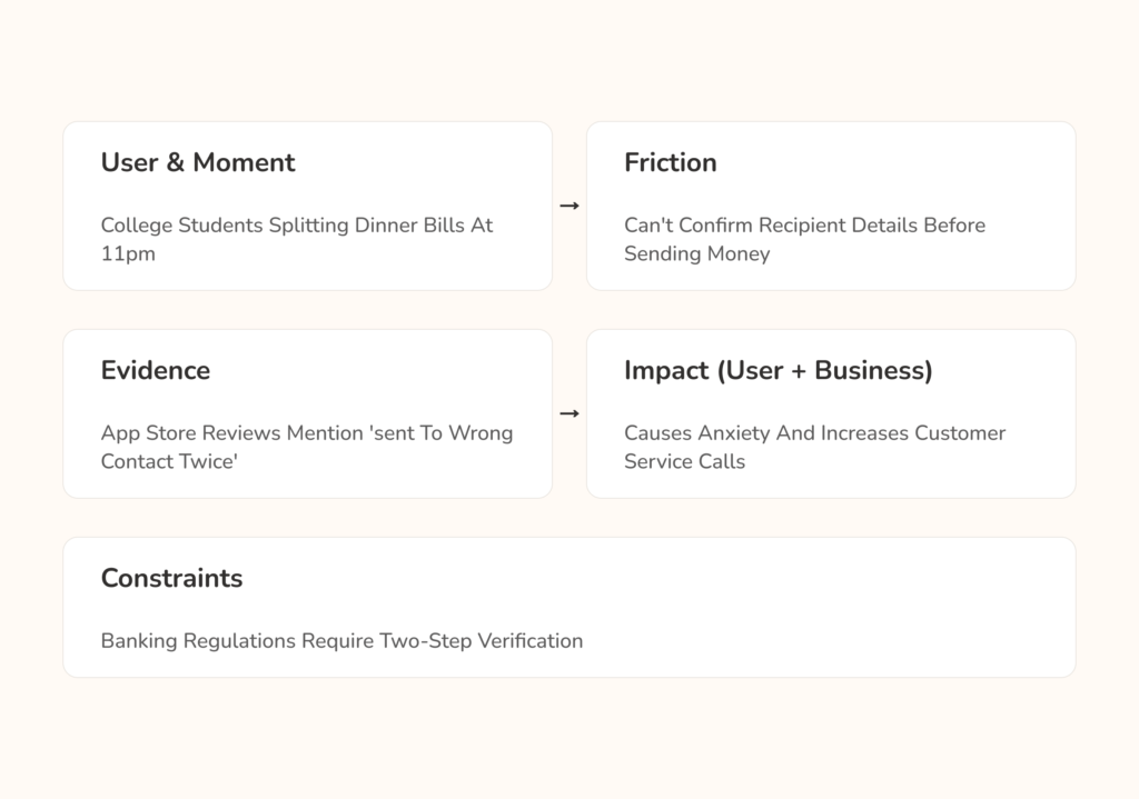
See how each arrow leads to the next piece? And notice there’s no “so we should build…” anywhere in there. That comes later, sweetheart. First, you prove you understand the problem completely.
Use this template every single time, and you’ll never accidentally write solutions when you mean to write problems.
Junior-realistic Examples
Food Delivery – When You’re Hungry and Stressed
You’ve probably written something like this before:
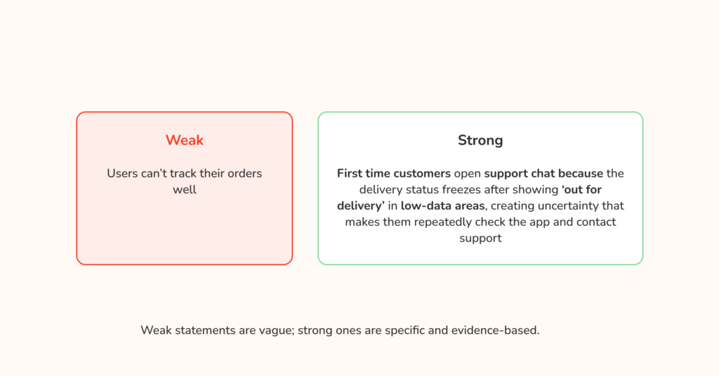
“Users can’t track their orders well.”
But listen to how much stronger this sounds:
“First-time customers open support chat because the delivery status freezes after showing ‘Out for delivery’ in low-data areas. The uncertainty makes them check the app over and over and eventually contact support.”
Can you feel the difference? The second version tells me exactly who’s struggling (first-time customers), when it matters most (during their first order), what specifically breaks (status freezes in low-data areas), and why everyone should care (support tickets cost money and uncertainty kills retention).
Now, if you were solving this, you wouldn’t redesign the entire app. You’d focus on 2–3 specific screens:
- A progress timeline with checkpoints that load even in low-data conditions.
- Simple text updates as fallback messages.
- Proactive status alerts when delays happen.
Your impact line? “Reduces support contacts from first-time customers and prevents order anxiety from turning into churn.”
E-commerce – When You Want to Buy but Can’t
Instead of writing:
“Checkout takes too long.”
Try this:
“First-time mobile shoppers abandon their cart at the payment step because the form asks for non-essential fields and shows generic error messages that don’t explain how to fix mistakes.”
Now you can design 2–3 targeted fixes:
- Streamlined card capture with autofill.
- Clear, specific error messages that tell users exactly what to fix.
- A progress indicator so shoppers know they’re almost done.
Fintech – When Technology Fails You
Rather than writing:
“KYC is frustrating and long.”
What if you wrote:
“Young adults using older Android phones fail identity verification in poor lighting because the camera guidance is unclear. After two failed attempts, they get locked out for 24 hours with no alternative path.”
Now you can solve it with specific changes:
- Better camera guidance with real-time edge detection.
- Immediate “retake” options instead of automatic lockout.
- A short grace period that lets them try again before shutting them out.
Do you see the pattern? Each strong statement makes it obvious what needs to be fixed. Each set of 2–3 screens connects directly to the problem. And each impact line proves you understand why the business should care.
That’s the power of getting this right.
What You're Probably Doing Wrong (And Why Employers Reject You)
I have reviewed over 500 portfolios from junior designers like you. The same mistakes appear again and again, and they are all fixable once you know what to look for. These are some of them so you avoid them:
- Using vague language.
When you write “people struggle with…,” you tell me you have not thought carefully about who actually has this problem. Change it to “working parents ordering lunch during their 30-minute break,” and suddenly I believe you understand the user and the moment.
- Sneaking solutions into your problems.
You write “users cannot find products easily, so we should add AI-powered search.” Stop right there. The problem is that users cannot find products. Full stop. Do not tell me the solution until you have proven you understand the problem. - No evidence the problem is real.
Everything starts with “I think users might…,” which tells hiring managers you are guessing. Senior designers do not guess, they show quotes, logs, screenshots, timings, and simple metrics that anchor the problem in reality. Check for public reviews on these apps or products or screenshot where you had problems while navigating the app. - Ignoring constraints.
You design as if you have unlimited budget, no technical limits, and the freedom to rebuild everything. Real products have tech debt, compliance rules, and operational limits. When you name the constraints, you sound like someone who has shipped in the real world. - Trying to solve too many problems at once.
Your statement mentions navigation, search, checkout, and onboarding. Pick one, solve it completely, then move to the next one. Focus is a hiring signal.
Fix these, and you stop sounding like a beginner. You sound like a designer who frames one clear problem, proposes two or three targeted screens, and explains one line of user and business impact. That is the voice of someone employers trust to solve real problems.
How to Write Your Problem Statement Step by Step
Alright, let’s get practical. Imagine I am sitting beside you while you write your first real problem statement. We will take it one clear step at a time.
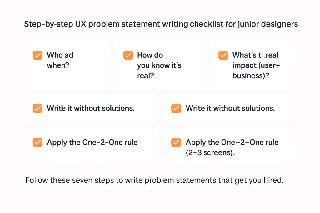
Step 1: Who and when
Do not say “users.” Be specific. “College students transferring money to friends after splitting dinner bills” tells me far more than “people sending money.”
Step 2: What breaks exactly
Avoid “the process is confusing.” Say the friction. “The transfer confirmation screen does not clearly show the recipient’s name, so senders worry they are sending money to the wrong person.”
Step 3: How you know it is real
Bring something concrete. App store reviews that mention this issue, a support ticket thread, your own recording of the flow, or a short note from three classmates who hit the same problem.
Step 4: The real impact
State both sides. For users: “causing anxiety and repeated checking of transaction history.” For the business: “increasing customer service calls and slowing adoption of the transfer feature.”
Step 5: The boxes you must design inside
Write the constraints. Maybe the backend cannot change quickly. Maybe compliance requires a confirmation step. Maybe the support team is at capacity. Constraints make you sound like a grown-up designer.
Step 6: Write the statement without any solutions
Describe only the friction. No hints. No feature names. Just the who, when, what breaks, evidence, impact, and constraints.
Step 7: Apply the One–2–One rule
Now design two or three screens that fix this exact problem. Not ten screens. Not a whole new app. Two or three targeted changes that remove the friction you named.
A quick example you can model
Problem statement
“College students transferring money to friends after splitting dinner bills worry they might send it to the wrong person because the confirmation screen truncates the recipient’s name and shows no recognizable details, leading to repeat history checks and increased support chats during evening hours. Compliance requires a confirmation step and the current backend cannot verify contacts in real time.”
2–3 screens that fix it
- A confirmation screen that shows the full recipient name, profile photo or initials, and the last four digits of the account.
- An error-proofing hint under the confirm button that says “Check name and last four digits before sending.”
- A success screen with a clear receipt, a “Report a mistake” link, and an easy way to copy or share the receipt.
One impact line
“Reduces support chats about misdirected transfers and increases repeat use of the transfer feature.”
Take your time with this. Designers who rush these steps keep getting rejected months later. Designers who slow down, prove the problem, and apply One–2–One start hearing yes.
Practice Makes Perfect (And Perfect Gets You Hired)
You know what I love about working with designers like you? You’re willing to practice. And practice is the difference between designers who keep getting rejected and designers who get hired on the spot. So let’s practice together.
Easy level
Take these vague statements and make them specific:
- “Users drop off during checkout.” Who exactly? When? At which step do they leave? (PS. Feel free to make up realistic scenarios)
- “KYC is difficult.” Difficult how? For which users? Under what conditions?
Do not move on until you can rewrite these with a specific user, a specific moment, and a specific friction point.
Medium level
Pick any strong problem statement you have already written and add real evidence. Find an app store review, a support forum post, or a usability test that backs up your claim. Then add at least one real constraint that would shape how you solve it.
Hard level
This is where most designers stumble. Take your strong problem statement and design exactly two or three screens that fix that specific friction. For each screen, tell me:
- What changes?
- What the user now understands differently.
- How you would measure whether it actually worked.
The designers who can do this last exercise are the ones who sound like problem solvers in interviews. They are the ones who get hired on the spot.

Step 1: Who and when
Do not say “users.” Be specific. “College students transferring money to friends after splitting dinner bills” tells me far more than “people sending money.”
Step 2: What breaks exactly
Avoid “the process is confusing.” Say the friction. “The transfer confirmation screen does not clearly show the recipient’s name, so senders worry they are sending money to the wrong person.”
Step 3: How you know it is real
Bring something concrete. App store reviews that mention this issue, a support ticket thread, your own recording of the flow, or a short note from three classmates who hit the same problem.
Step 4: The real impact
State both sides. For users: “causing anxiety and repeated checking of transaction history.” For the business: “increasing customer service calls and slowing adoption of the transfer feature.”
Step 5: The boxes you must design inside
Write the constraints. Maybe the backend cannot change quickly. Maybe compliance requires a confirmation step. Maybe the support team is at capacity. Constraints make you sound like a grown-up designer.
Step 6: Write the statement without any solutions
Describe only the friction. No hints. No feature names. Just the who, when, what breaks, evidence, impact, and constraints.
Step 7: Apply the One–2–One rule
Now design two or three screens that fix this exact problem. Not ten screens. Not a whole new app. Two or three targeted changes that remove the friction you named.
A quick example you can model
Problem statement
“College students transferring money to friends after splitting dinner bills worry they might send it to the wrong person because the confirmation screen truncates the recipient’s name and shows no recognizable details, leading to repeat history checks and increased support chats during evening hours. Compliance requires a confirmation step and the current backend cannot verify contacts in real time.”
2–3 screens that fix it
- A confirmation screen that shows the full recipient name, profile photo or initials, and the last four digits of the account.
- An error-proofing hint under the confirm button that says “Check name and last four digits before sending.”
- A success screen with a clear receipt, a “Report a mistake” link, and an easy way to copy or share the receipt.
One impact line
“Reduces support chats about misdirected transfers and increases repeat use of the transfer feature.”
Take your time with this. Designers who rush these steps keep getting rejected months later. Designers who slow down, prove the problem, and apply One–2–One start hearing yes.
How to Present This So You Sound Like a Senior Designer
One thing most junior designers don’t realize: the interview starts the moment they ask you to walk through your work. The way you present your problem statement sets the tone for everything that follows. And that starts with the case study you submit to them.
In your case study, lead with the problem.
Your project title should sound like this: “We found that first-time buyers were abandoning checkout due to unclear error messages and fixed it with three targeted changes that increased completion rates by 23%.”
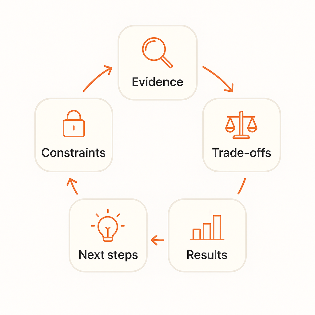
Your case study should tell the story in this order:
- Here’s the evidence I found.
- Here are the constraints that shaped my approach.
- Here are the trade-offs I had to make.
- Here are the results we got.
- Here’s what I would try next.
In interviews, start with your problem statement.
Say something like: “I identified that working parents using food delivery apps were abandoning orders when the ETA became unclear during peak hours, which was costing restaurants an estimated 15% of their lunch revenue. Given the constraints of legacy tracking systems and the need for a mobile-first solution, I focused on three specific changes…”
Do you hear how confident that sounds? How business-focused it is? How much it positions you as someone already thinking like part of their team?
That’s the difference between junior designers who get hired and those who keep getting rejected.
How to Get Better Through Real Feedback
One thing I wish someone had told me earlier in my journey: you can’t see your own blind spots. That’s not a flaw, it’s just how our brains work.
When I work with designers, this is how I make their problem statements stronger so they can get hired faster:
- I start by acknowledging what’s working. Maybe you picked a clear user group, or you connected the problem to business impact. You need to know what you’re already doing right.
- Then I point out where the problem and solution don’t align. This is the most common mistake. You say users struggle with one thing, then design something that fixes something else.
- Next, I suggest one small fix. Not a full rewrite. Just a sentence to sharpen or a screen to adjust. Small changes compound into big transformations.
- I always explain why that fix matters, and how it connects back to user needs or business goals. Understanding the “why” helps you make better choices on your own.
- Finally, we iterate. Two drafts minimum. Usually three or four before it really clicks.
This process works whether you’re getting feedback from a mentor, a peer, or even reviewing your own work with fresh eyes the next day.
When It Gets Hard, Remember This
You’re not “bad.” You’re not missing some special talent. You’re just under-practiced at framing problems in business terms.
I’ve seen this transformation happen again and again. Just last month, two of my mentees got hired on the spot after this clarity clicked for them. Not because they suddenly became world-class designers, but because they learned how to clearly communicate the value of their thinking.
The path is always the same: clarity leads to confidence, confidence builds trust, and trust gets you offers.
So when you’re sitting in that interview, feeling nervous, remember: you can solve problems. You can think through constraints. You can connect user needs to business impact. You just need to learn how to talk about it clearly. And that’s not a talent you’re born with. It’s a skill you can learn.
Two of our mentees were hired on the spot after this clarity clicked.
Most Senior designers won't tell you this
Sometimes smart solutions don’t ship. Not because they’re bad, but because of regulation, tech debt, operational complexity, or cost and other reasons.
Understanding this doesn’t make you less creative. It makes you more hireable.
When you acknowledge constraints in your problem statements and solutions, you sound like someone who has worked with real products in real companies. Someone who can design inside the messy reality of business, not just the perfect world of school projects.
Companies want to hire designers who can work with their limitations, not designers who pretend limitations don’t exist.
How to know what solution to design
If you remember nothing else from this conversation, remember these three things:
- One clear problem you can explain in thirty seconds.
- Two or three focused changes that actually fix that specific problem.
- One impact line that shows success for both users and business.
If your case studies follow this structure, and your interview stories do too, you’ll sound like someone who can move a business from where it is to where it needs to be.
And that’s exactly the kind of person companies want to hire.
You now know the problem statement approach that helped designers like Kemi (8 months of rejections → ₦450k fintech offer) and Stanley (hired on the spot during his interview).
But one thing I’ve learned from working with 1,000+ designers is this: knowing the framework is just the beginning. The real change happens when someone helps you see the gaps you can’t spot yourself.
That’s what we focus on in our mentorship. Developing the kind of problem-solving clarity that makes employers think, “This person actually gets it.”
If that sounds helpful, I’d love to share more about how we can work together.
